
Designing a Better CLI Progress UI with Rich
The most frustrating part of a long-running translation command is not always the wait.
It is the moment when the command is still running, but the user has to reconstruct what is happening from scattered terminal output.
Co-op Translator translates Markdown files, notebooks, and image text into multiple languages. For a small README translation, a simple bar and a few Done messages can be enough. But once the workflow includes repository-wide translation, outdated file refreshes, token estimates, and multiple content types, progress output becomes more than decoration. It becomes the screen a user relies on to understand the run.
That was the reason behind the Rich-based CLI progress UI in Co-op Translator v0.20.0. The goal was not to make the terminal flashy. The goal was to keep the user oriented while the workflow moves through files, stages, estimates, and completion results.
This article covers three things.
First, why the old emoji/bar-style output became too small for the workflow.
Second, how the Rich header, tables, and progress row were organized around user questions.
Third, why GitHub Actions and log environments still need plain fallbacks.
The main design question is simple: what does the user need to know next?
A percentage is not enough
The first thing people expect from progress output is a percentage.
30%
But for a translation workflow, the percentage is only part of the answer.
The user usually has more practical questions:
- Which command did I run?
- Which mode is active?
- Which target language is being processed?
- How large is the job?
- Which stage is running now?
- Which file is currently being translated?
- What was written after the run completed?
If the output does not answer those questions clearly, the user starts doing manual reconstruction. They scroll up to find the command. They look for the active mode. They guess whether this progress bar belongs to Markdown, notebooks, images, or a refresh pass.
A progress UI should reduce that reconstruction work.
So the design question was not "How do we make the bar look nicer?" The better question was "How do we keep the user oriented while the command runs?"
The old output was fine at the beginning
Simple output is often the right place to start.
For a small CLI, emoji, short status lines, and a basic bar are fast to build and easy to understand. They keep the implementation small and let the user know that work is happening.
The problem appears when the workflow grows but the output model stays the same.
Over time, the Co-op Translator command accumulated more modes and responsibilities:
- Markdown translation
- Notebook translation
- Image text translation
- README-only translation
- Outdated translation refresh
- Link migration
- Evaluation-driven retranslation
Each mode asks the UI to emphasize something different. Markdown translation cares about the current source file. Image translation may care more about provider configuration and extracted text. A refresh pass needs to distinguish new work from outdated translations.
If all of that is compressed into one progress line, the line becomes crowded. If too much information is removed, the user loses context.
That is when progress output starts to look less like a message and more like a small interface.
Why Rich was a good fit
Rich was not useful only because it adds color.
It was useful because it let the terminal output be composed like a small UI:
Panelcan group command contextTablecan align estimates and summariesProgresscan show stage, count, percentage, and current file in one row- Terminal detection can choose between Rich output and plain text
That made it possible to design progress output as a readable surface instead of a stream of unrelated messages.
The implementation still needed a boundary.
The translation logic should not know about Rich directly. It should not import table, panel, or progress bar primitives. In Co-op Translator, that role is handled by a shared ProgressReporter. Translation code calls progress operations such as file_started, file_completed, and update. The reporter decides whether to render those updates with Rich or fall back to plain text.
That boundary matters because a CLI UI library should improve the interface without leaking into the core translation workflow.
The screen answers four questions
The final screen is organized around four practical questions.
The first question is: what did I run?
The command header shows the command, version, mode, target language, and root directory. This matters when a user looks at a screenshot or revisits an old log. The header makes the run identifiable without requiring the original shell command to be nearby.
The second question is: how large is this job?
Translation has cost and time implications. Token estimates and estimated words should appear before the moving progress row because the user wants to understand the size of the work before watching it move.
The third question is: what is moving now?
The live progress row shows stage, progress count, percentage, and current file together. This is the area the user watches while the command is running.
The fourth question is: what happened at the end?
Once the live progress is gone, the result matters more than the animation. Short completion lines show which file was translated and where the output was written.
The screen ended up looking like this:
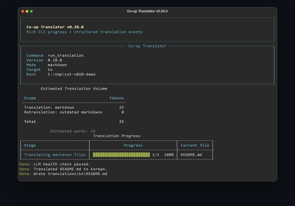
Each part has one job:
- Header: identify the run
- Estimate: show the scale of the work
- Progress: show the active stage and file
- Completion lines: leave a readable result behind
The order matters. A user first needs context, then scale, then live movement, then outcome.
CI and logs need a different answer
A good terminal UI is not automatically a good log format.
In an interactive terminal, a Rich progress bar is useful. In GitHub Actions or redirected logs, live progress can become noisy. ANSI control sequences may be preserved, repeated progress updates may crowd the log, and tables can be harder to read in narrow log viewers.
So the output style has to adapt to the environment.
Co-op Translator uses Rich output for interactive terminals by default and falls back to plain text in CI or non-interactive environments.
It can also be controlled explicitly:
CO_OP_TRANSLATOR_OUTPUT_STYLE=plain
CO_OP_TRANSLATOR_OUTPUT_STYLE=rich
CO_OP_TRANSLATOR_NO_PROGRESS=1
plain forces simple text output. rich forces Rich output. CO_OP_TRANSLATOR_NO_PROGRESS=1 keeps summaries but suppresses live progress bars.
These controls matter because each environment values a different kind of readability.
In a local terminal, motion helps. In CI, searchable logs are more important. In file logs, plain text is safer than color and box drawing.
The same state can be presented differently depending on where it is going. That is why the output layer has to know the environment, while the translation workflow should keep producing the same progress state.
Beautiful output is not the integration contract
There was one more design constraint: a nicer CLI should not become the thing external systems depend on.
I wrote more about that in Progress Bar Is Not an API. The short version is that human-facing progress output and machine-readable structured events need to be separate surfaces.
For this article, the important point is that Rich is the human renderer.
If Localizeflow or another automation system needs progress state, it should not parse the Rich table. It should use structured events through --json-events, the Python API callback, or the MCP event payload.
That separation gives the CLI room to improve.
If changing a table layout, header label, or color becomes an integration breaking change, then the CLI cannot evolve freely. Rich should improve the user experience. Structured events should support system integration.
The lesson
This work changed how I think about progress UI.
It is not only about attaching a bar to a slow command.
While a command runs, the user keeps asking small questions:
Is it alive?
Which stage is active?
What is it processing?
How much is left?
What did it produce?
A good CLI progress UI answers those questions before the user has to ask them.
Rich helped make those answers easier to read. But the more important work was deciding which information belonged on the screen, and in which order.
The principle I took from this work is:
A good progress UI does not decorate a command. It answers the user's next question.
As a CLI grows, progress output becomes a small product surface. When designing it, start with the user's orientation, not the percentage.